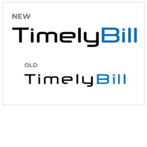
Welcome to the all-new chapter of TimelyBill's visual identity!
We're excited to unveil our redesigned logo. This updated logo goes beyond aesthetics; it symbolizes the very essence of our organization's development and progress.
The original TimelyBill logo was designed in 2001. Back then, we chose a futuristic font that fit well with our newly developed billing software... which was ahead of its time! Fast forward twenty-three years, and we felt it was the right time to update it.
We wanted to keep the same typeface but modify it to better align with our company as it is today. The updated logo is bolder in appearance, which will look better across various mediums. Whether printed on a ballcap, t-shirt, mobile app, or on the tradeshow floor... the new logo is ready to go.

"Our redesigned logo is a visual narrative of our journey... from a small start-up in 2001 to the industry-leading software company we operate today. It encapsulates who we are, where we've been, and where we're going." – Patrick LaJuett, CMO, TimelyBill.
Here are the visual changes our design team made to our new logo, and why:

Bolder Font: Symbolizes Software Growth
The choice of a bolder font in our logo is deliberate and meaningful. It stands as a visual representation of the substantial growth our software has experienced. The robust and weightier letters signify the strength and resilience of our technological advancements. Just as our font has become bolder, so has our commitment to pushing the boundaries of what's possible in the software world.

Tighter Letter Kerning: Conveys the Closer Integration of Components
Look closely, and you'll notice the seamless integration of letters in our new logo, achieved through tighter kerning. This deliberate spacing speaks volumes about the close-knit relationship between the various components of our software. It symbolizes the synergy and harmony that defines our innovative solution. As we bring our elements closer together, we foster a tighter integration of ideas, people, and technologies, creating a unified force driving us forward.

Taller Height: Signifies Our Company's Maturity
Height matters, especially when it comes to maturity. The increased height of our logo isn't just a visual choice; it represents the maturity our company has attained. We've grown not just in size but in wisdom and experience. The taller letters are a testament to the firm foundation on which we now stand, ready to tackle challenges with a depth of knowledge from years of dedicated service.

Longer Finial and Tail: Improved Aesthetics
Why lengthen the finial and tail? Because we believe in the importance of aesthetics. The widening of the letter elements in our logo isn't just for show; it's a subtle touch that enhances the overall visual appeal. We understand that a visually pleasing design reflects the care and precision we invest in every aspect of our work. It's a nod to the idea that looking good is just as important as being good – and we strive for both.
TimelyBill's new visual identity is a symbol of advancement, innovation, and the future of billing.